 Mary and Ellis wanted a Save the Date that would encompass all of the elements they will be incorporating into their wedding: bright colors, nature and fun fun fun!!! Mary designed a color and inspiration board to help me visualize the direction she wanted to go in and it helped tremendously! The end result is one of my most favorite designs! It's a standard size card that opens to reveal travel and accommodation information on the inside. Mailed in a gorgeous, teal blue envelope (not shown).
 Wednesday, December 23, 2009
Mary + Ellis - Save the Date
 Mary and Ellis wanted a Save the Date that would encompass all of the elements they will be incorporating into their wedding: bright colors, nature and fun fun fun!!! Mary designed a color and inspiration board to help me visualize the direction she wanted to go in and it helped tremendously! The end result is one of my most favorite designs! It's a standard size card that opens to reveal travel and accommodation information on the inside. Mailed in a gorgeous, teal blue envelope (not shown).
 Alexis + Ben - Save the Date
 Alexis and Ben wanted something bright, crazy and fun for their Save the Date. Alexis thought we could "save" the tradition for the wedding invitation and really blow out the Save the Date with color and composition. I decided on my radiant, starburst design mixed with a tons of bold colors. It being a postcard, we wanted the Save the Date to stand out from "regular, boring" mail and we were all very pleased with the finished design.
Elizabeth + Anthony - Save the Date
Lindsey + Jacob - Save the Date
 Lindsey and Jacob are very special friends of mine and I was thrilled when they asked me to design their Save the Date. Lindsey knew that she wanted to incorporate the wedding colors (kelly green and cabana blue with accents of burnt orange) and a "natural" feel. She also liked the idea of using a calendar as a visual element. Taking all of that into consideration, I designed this bright yet subtle postcard Save the Date. BONUS: postcard postage is almost half the price of regular postage!
Natalie - Bachelorette Party
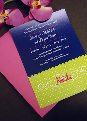
 Oh, I love this invitation! The hostess wanted a fun, bright invitation to their Bachelorette Party in Pittsburgh, but she didn't want a "typical" or "expected" invitation. Using what I knew about the bride (and the specific wedding color palette) I was able to design a vivid, joyful invitation to set the mood for this memorable event!
Alexis and Ben - Couple's Shower
New Stationery Designs!
Programs, Menus, Gift Baskets, oh my!
 At J Press Designs, we know that it's the little things that matter! We offer our services to extend to all aspects of events including Gift Basket Tags, Wedding Programs and Menus. Each project was carefully designed to correspond with other design aspects that had been incorporated into the events.
Tuesday, December 15, 2009
Inside the Design

Recently, our friends in Jeffrey James and the Haul (one of the coolest bands in Memphis) asked us to design a t-shirt for them. We gladly accepted and were quite pleased with the result. Soon after, Norococo (a fantastic design blog) asked us to write a little something about how we arrived at the final design and, well... click here to find out! Remember - It's not to late to order those calendars! Click here for more information! Happy Holidays!
Subscribe to:
Posts (Atom)


